Wednesday, September 17, 2008

Worst Design of the Month 17.9.2008


Choosing a bad design tends to get ugly and quite frustrating, seeing as there are so many horrible designs in the market. There is one truly terrifying design, which a lot of kids must experience on a daily basis. The new school chairs. The horrible plastic, painful, and small chairs are a burden for many kids. Why isn't this a great design? oh well this question is very easy, and I am sure many would like to answer this. Well, the chairs aren't a great design because they aren't comfortable; at all. Although they don't look bad, and they do have a nice modern feel to them, they still tend to get annoying. I have never seen so many people fall of their chairs in two weeks. The sit itself is too short for the average person, and it gets really irritating. With time you do get used to it, but the a good design needs to be user friendly; meaning get used to it from the first second. It isn't the worst design that was ever created but it is definitely not the best. It does force you to sit up straight which is probably that main reason the chose this chairs. They do look quite nice but appearance is not everything. It doesn't feel comfortable, or relaxing. The worst design of the month has it screaming for the new upper school chairs.

Article of the Week

iPod Touch (Second Generation)

Starting from today, I will post a great design onto my blog every week. This week the design that takes home the trophy is the second generation iPod Touch. The remake of the first model definitely stands out, and has a lot of great features the first didn't have. Lets start off with its actual design concept. The new iPod Touch's design, has changed quite a bit. The back of the iPod is still made out of steel (not stainless unfortunately) but a very slick metal that gives a great visual outlook. It isn't as squared as the first generation, in fact Apple decided to adapt the design of the 3G iPhone and apply it to the new iPod. What you get now, is a rounded back made out of the same material. It does add a firmer grip to the consumer and allows for a better feeling when holding it. The volume and switch on/off button are made of black plastic which, isn't has fancy as the iPhone's metal switches but still has a nice effect. This gives the design a much more luxurious feel to it. The screen itself is still a beautiful 3.5" inch screen, but now the glass covers the entire front body; again giving a much better visual look. This is not all though. Apple has decided to add an external speaker, and a voice recorder. This is the first iPod to include such features. Now you can listen to your music on the go, without having to carry those huge hi-fi stereo systems *YAY*. The main design stayed the same. Don't expect to get new type of menus or settings of any kind. The only new thing you will get, is the App Store. The App Store might not apply to design that much, but it is a great new feature that allows you to download applications to your device. This is compatible with the iPhone and iPod Touch. If you still own the old iPod you can get the App Store by updating your iPod and paying something around 15 CHF. So let's recap. Why does the iPod Touch get the award for the design of the week? First of all, the great new design adaption from the 3G iPhone; everyone loves it. Second of all, the external speaker, which bring the iPod's to a new era that allows you to listen to your music on the go. Last but not least, is the price. The prices for the iPod Touch have gone done by a lot. This is not because Apple is doing a bad job, its because Apple is doing a great job. The iPod Touch second generation has it all; from internet browsing, photo browsing, music, videos, a great price and three different capacity models, to a great beautiful and slick design. The iPod Touch takes home the trophy for the design of the week; and it truly deserves it.
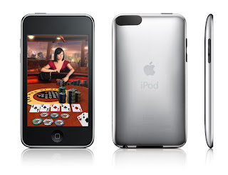


http://en.wikipedia.org/wiki/IPod_Touch

Chapter 6 Summary

The concluding chapter of the four main design principles really sums up all of what we learned. It explains the first five chapters. It states clearly that you shouldn't worry too much about you design. If you follow the principles then it should be fine. No more no less. It also says that if you see a design you like; steal it. Now, it never says take it and use it exactly the same, because that can lead to copyright issues. What it says is take a design you admire, and adapt it. All the designers do it. Everyone does it, and not just for designs, but for everything; movies, video games, books, magazines, etc. Follow the principles, keep it simple, take a design you like, adapt it, and you design should be good.

Tuesday, September 16, 2008

Poster (Edited #4)


For my 4th edit on my poster, I used contrast to twick my poster. First of all, I added contrast to the colors of the background image. This allowed the black title to be displayed and shown much nicer. It also allowed the body text to be displayed. Overall it looks a lot nicer now, after the contrast concept as been applied and furnished.

Thursday, September 11, 2008

Contrast

Contrast is the key effect for visual interest in a design. It is probably the best way to attract people into looking at your design. To create contrast, you need to take to things that are alike and change them completely from one another. Use colors, line thickness, sizes, and spaces. If you use contrast correctly then you design will be eye catching and visually attractive.

Poster (Edited #3)


For my the third edit on my poster, I used the repetition principle. What I did was repeat text spacing, fonts, and colors. This allowed for a clearer and more impressive look.

Wednesday, September 10, 2008

Repetition

Repetition is the the idea stating that, when you repeat something you add visual interest. Repetition unifies and strengthens a design to make it look more sustained. It design people usually refer to repetition as being consistent. To get repetition you should repeat similar fonts and colors. Sometimes contrast as a lot of principles that could add to repetition. Avoid repeating something over and over because it makes you design dull and boring. It shouldn't be over repetitive or under repetitive. If you practice enough you will learn to master repetition. If you over repeat your design will look confusing, and over-whelming; and not the good kind.