Exterior Design
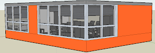
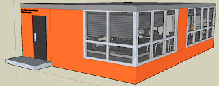
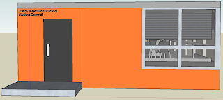
The Student Council office room that I have built is a very simplistic structure from the outside yet very well thought of. First of all: Color. The colors that I have chose for the exterior consist of: Orange and a few different shades of grey. I did not want to follow through with all of my colors (color scheme: Orange, Red, Grey) due to the fact that it would look chaotic, and display the Student Council office as "unorganized". So by applying one shade of orange and three consistent but different shades of grey I believe that I got the perfect match that still manages to display the company's brief. The structure that I have built is a simple rectangular structure that allows for a lot of space in the interior. The room itself as a step towards the 'entry' door, and the right side of the room is filled with windows. As you can see in the pictures below there is one set of windows both near the door and on the other opposite side. However the right side of the building consists of just windows to bring in a lot of light, and to be able to save electricity on sunny days. Near the entrance you can also see a that there is a sign saying: "Zurich International School Student Council" and it is placed near the door in a metallic color, to give a professional feel and allow the people passing by to know that this is the 'official' Student Council office.
----------------------------------------------------------------------------------
"The Entrance"
----------------------------------------------------------------------------------
Interior Design
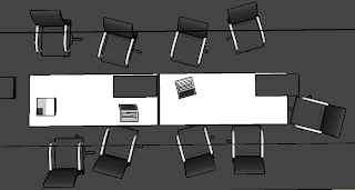
The interior design of the Student Council office came out looking very elegant yet very subtle. I began by thinking what my color choice should be, and quickly came to the decision that it has to be two consisted colors. I did not want to involve Orange or Red for the obvious reasons of eye distractions that they may cause to certain individuals and so I decided to go with Grey and White. Why? because they are simplistic, elegant, and very eye-catching allowing the Student Council members to work without hesitations. Before building this office I designed two others where I just put in a meeting table in the middle and a projector at front, yet it did not seem to work with Student Council, and that is the reason I decided to change it all and re-design it from the beginning. I decided to build three part to the office: The Meeting Table (with projector/smart-board), Working Area (Table + Chairs, Phones, Papers, etc.), and finally a Couch Area for the members to be able to sit comfortably and talk among themselves. The problem now was only to choose the placement for each one of these areas. I began with the 'Meeting Area' and decided that it would fit best to put it as far away from the windows as possible to prevent as much glare on the smart-board even if the shaders are down. The second area I looked at was the 'Couch Area' which I decided to put in the entrance side near the windows to bring a warm and relaxing feeling where ideas can come to mind easily. Finally I looked at the 'Working Area' and said "Well, there is no other place to put it besides in front of the 'Couch Area'", so that is exactly what I did and it came out looking pretty slick (Yes, people still use that word). The furniture that I chose was a very modern selection because I wanted to reflect the "New" building and the "New" re-design of the Zurich International School: Website/Logo. The last thing I struggled with were the chairs. It took me quite a long time to figure out which chairs I will choose but eventually came up with the idea that I prefer comfort over pain, and while they aren't the prettiest collection of chairs in the world they sure aren't the ugliest.
----------------------------------------------------------------------------------
"Meeting Area - From Above"

"The Chairs"


No comments:
Post a Comment