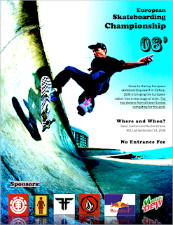
For my 4th edit on my poster, I used contrast to twick my poster. First of all, I added contrast to the colors of the background image. This allowed the black title to be displayed and shown much nicer. It also allowed the body text to be displayed. Overall it looks a lot nicer now, after the contrast concept as been applied and furnished.
No comments:
Post a Comment