Wednesday, June 10, 2009

Advertisement - Extra Credit

A friend of mine and I designed a advertisement for a school event (soccer/football). It was shown with a black background and a simple round soccer ball in the middle. The ball had a reflection which showed up very well on the black background. Inside the ball we put different segments of information (time, place, etc.).

Goal Keeping Booklet - Extra Credit

Four friends of mine and I converted an entirely drawn "Goal Keeping" book into a digital format. It was a lot of hard work, yet we all got to feel how working is in the real world. One word: stress. There were countless of fights between the five of us, arguments, and vulgar language. We had two days to complete this book, due to the fact that the person that needed it had to go to a conference meeting and present the book. Three of us did stick figure pictures (on Pivot), while two others formated the text within the book. It came out looking pretty nice, yet our friendships were destroyed forever.

Grease Play - Teaser - Extra Credit

The Grease poster that my fellow comrade and I made, came out absolutely stunnin'. It had it all: a 60's font (light blue), a simple black background, a old school Chevy (light blue), and a catchy teaser'ish' title: "tell me more". Get it? oh and let's not forget the almighty reflection.

Summer Nights: Lyrics - Youtube Link at the Bottom

Boy: Summer loving had me a blast
Girl: Summer loving happened so fast
Boy: I met a girl crazy for me
Girl:Met a boy cute as can be
Both: Summer days drifting away to uh oh the summer nights

wella wella wella

Boys: Tell me more, tell me more
Did you get very far
Girls: Tell me more, tell me more
Like does he have a car

Boy:She swam by me she got a cramp
Girl:He ran by me got my suit damp
Boy: I saved her life she nearly drowned
Girl: He showed off splashing around
Both: Summer sun something's begun but uh oh the summer nights
wella wella wella

Girls:Tell me more, tell me more
Was it love at first sight?
Boys: Tell me more, tell me more
Did she put up a fight?

Boy: Took her bowling in the arcade
Girl: We went strolling drank lemonade
Boy: We made out under the dock
Girl: We stayed out till ten o'clock
Both: Summer fling don't mean a thing but uh oh the summer nights
wella wella wella
Boys: Tell me more, tell me more
But you don't gotta brag
Girls:Tell me more, tell me more
Cause he sounds like a drag

Girl: He got friendly holding my hand
Boy: She got friendly down in the sand
Girl:He was sweet just turned eightteen
Boy: Well she was good you know what I mean
Both: Summer heat boy and girl meet but uh oh the summer nights

Girls: Tell me more, tell me more
How much dough did he spend?
Boys:Tell me more, tell me more
Could she get me a friend?

Girl:It turned colder that's where it ends
Boy: So I told her we'd still be friends
Girl: Then we made our true love vow
Boy: Wonder what she's doing now

Both: Summer dreams ripped at the seams but oh those summer nights
Tell me more, tell me more

Youtube Link

Tuesday, June 9, 2009

Student Council Website

Designing the website for Student Council was probably one of the more difficult projects that we has Digital Design students have had to undergo. Let's begin with the tutorials, and as Simon Cowell would say: "Pure Utter Rubbish". The person that made the tutorials was so boring and mono-tone that you could just fall asleep while listening (that is if you actually decided to listen). Anyhow, this isn't about the difficulty of the project, this is about what I have done, and what I have accomplished. I began this project just as I begin any other: I think of a plan and slowly begin to maneuver throughout the design process. The first question mark I put was on the color scheme of the website. I knew I had to follow the original color scheme that I have created earlier in the year (Orange, Red, Grey) but did not know on wether I wanted to use all of the colors, or wether I wanted to integrate other shades. I quickly came to conclusion that because this is 'the' Student Council website it must represent them to their fullest extent therefore it must show their full color scheme. So I decided I will use grey as my background color due to the fact that it is very easy on the eyes and works perfectly well with my next point: Orange. It was hard for me to decide on wether I would rather have orange or red has 'page background color', and yet again quickly, I chose orange, simply because it looks so perfectly connected to the tone of grey that I used as my main background. I decided to represent the color 'Red' in the form of a box which was from the center of the page to the bottom. I also decided to add a 1-mm border in the color red to the secondary orange background. Finally I decided that my navigation box will be in 'White' and will consist of Serif like fonts in the color black. However when you put the cursor over these words: News, Information, About Us, Register, then they turn into the same orange as the secondary background color with a grey border as the main background color. Confusing, I know, but hang in there. Next was the logo. This was another extremely difficult area for me to decide on. I knew I wanted it to be on the same level as the navigation bar, yet I did not know which side: left or right. I asked several people and got an equal amount of opposing responses, and decided to go with my heart (and the teacher's recommendation): right. It simply looked better. Under the navigation bar a picture will be placed according to the recent news with a sub-headline. At the bottom left of the page (grey) there is a pause/play button for the background music which I selected to begin automatically as the page loads. The music is a relaxing loop that adds a modern atmosphere to the design and webpage. To conclude the "Main Page" I added an additional four buttons in the center of the red box. They go as follows: Learn, Care, Challenge, Lead. Any clues? that's right, that is the Zurich International School Philosophy, and I thought that it would be a very important aspect to put into the Main Page for the obvious reasons of advertising it. It seems as if only this year, kids began to see what the Zurich International School Philosophy is, and many still do not know it. The sub-pages are simply the same as the Main Page yet they do not include the red box. I do not believe that red is the most important color in the color scheme so I did not find it harmful. They are all consistent to one another including to the Main Page, and they all include a title of 36-mm.

What a charm uh?

----------------------------------------------------------------------------------
"Main Page"
"Navigation Bar"
"Cursor Over Button - Black to Orange Effect"
"The Student Council Logo"
"The Image Position"
"Learn, Care, Challenge, Lead - on the Red Box"
"Play/Pause Button - Music"
"Sub-Page"

Office Design - Student Council

Exterior Design

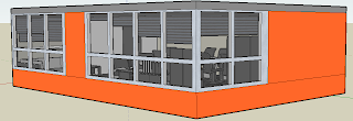
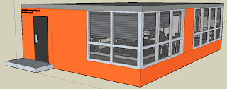
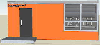
The Student Council office room that I have built is a very simplistic structure from the outside yet very well thought of. First of all: Color. The colors that I have chose for the exterior consist of: Orange and a few different shades of grey. I did not want to follow through with all of my colors (color scheme: Orange, Red, Grey) due to the fact that it would look chaotic, and display the Student Council office as "unorganized". So by applying one shade of orange and three consistent but different shades of grey I believe that I got the perfect match that still manages to display the company's brief. The structure that I have built is a simple rectangular structure that allows for a lot of space in the interior. The room itself as a step towards the 'entry' door, and the right side of the room is filled with windows. As you can see in the pictures below there is one set of windows both near the door and on the other opposite side. However the right side of the building consists of just windows to bring in a lot of light, and to be able to save electricity on sunny days. Near the entrance you can also see a that there is a sign saying: "Zurich International School Student Council" and it is placed near the door in a metallic color, to give a professional feel and allow the people passing by to know that this is the 'official' Student Council office.

----------------------------------------------------------------------------------
"The Entrance"
"Opposite Side of the Entrance"
"Left side of the Room - Window Side"
"Entrance and Window Side"
"The Entrance"

----------------------------------------------------------------------------------
Interior Design

The interior design of the Student Council office came out looking very elegant yet very subtle. I began by thinking what my color choice should be, and quickly came to the decision that it has to be two consisted colors. I did not want to involve Orange or Red for the obvious reasons of eye distractions that they may cause to certain individuals and so I decided to go with Grey and White. Why? because they are simplistic, elegant, and very eye-catching allowing the Student Council members to work without hesitations. Before building this office I designed two others where I just put in a meeting table in the middle and a projector at front, yet it did not seem to work with Student Council, and that is the reason I decided to change it all and re-design it from the beginning. I decided to build three part to the office: The Meeting Table (with projector/smart-board), Working Area (Table + Chairs, Phones, Papers, etc.), and finally a Couch Area for the members to be able to sit comfortably and talk among themselves. The problem now was only to choose the placement for each one of these areas. I began with the 'Meeting Area' and decided that it would fit best to put it as far away from the windows as possible to prevent as much glare on the smart-board even if the shaders are down. The second area I looked at was the 'Couch Area' which I decided to put in the entrance side near the windows to bring a warm and relaxing feeling where ideas can come to mind easily. Finally I looked at the 'Working Area' and said "Well, there is no other place to put it besides in front of the 'Couch Area'", so that is exactly what I did and it came out looking pretty slick (Yes, people still use that word). The furniture that I chose was a very modern selection because I wanted to reflect the "New" building and the "New" re-design of the Zurich International School: Website/Logo. The last thing I struggled with were the chairs. It took me quite a long time to figure out which chairs I will choose but eventually came up with the idea that I prefer comfort over pain, and while they aren't the prettiest collection of chairs in the world they sure aren't the ugliest.

----------------------------------------------------------------------------------
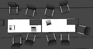
"Meeting Area - From Above"
"Couch Area"
"Working Area"
"Meeting Area - Smart-Board (Left) Working Area (Right)"
"The Entire Interior"
"The Chairs"


Tuesday, May 5, 2009

Weekly Post #25 (Special Edition)
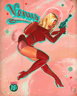
Past - Present

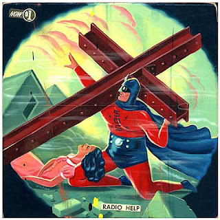
Ryan Heshka, born in 1970 is an artist that creates pieces which remind us of the past. He tries to aim is work towards an older audience in order to let them achieve a feeling of deja-vu. He himself stated that he tries to make his childhood memories come to life. His inspirations comes from his daily life, old comics, posters and advertisements, B movies, or Jazz. His works all contain a unique narrative of the past with a glimpse of the future. He tries to capture a certain emotion in each one of his works. "If only for a moment" he says. While is work is done in a style of the past, and seems quite primitive it does have an effect on people who have witnessed that time and design period. Unfortunately for those of us that haven't it is quite harder to get into his work, unless you have played the 'Fallout' series.


Weekly Post #24 (Special Edition)

Family Portraits

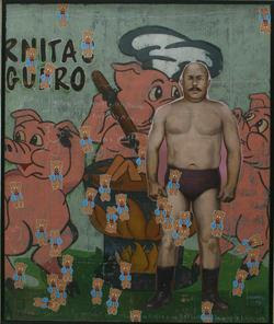
Armando Romero, born in Mexico in 1964 uses the the popular imagery of his country of origin at the beginning of the century. He uses visual codes such as photography, movie posters, cartoons or graffiti from back in the day to represent the modern culture. It is a parody of the past, present, and the future. With his unique sense of humor he makes fun of what his serious, and acts like a funny anarchist who does not spare anybody. He mixes absurd and reality, adding a sense of complete randomness and at some level, nostalgia of the past. "It is a journey between surrealism and the baroque, where all resources are pretexts to create illusions" he says. His work would not be what it is without his allusions. It doesn't mention anything, but you can get a sense of what he is trying to say, and what his message his, and that is the true beauty of his work.

Weekly Post #23 (Special Edition)

Anonymous Days

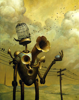
Scott Scheidly began his art career at the age of 4 after chewing oil colors, and turning his nappies into an extraordinary piece of art. He later went to study art and received a diploma, and quickly began his art career. The amazing artist truly inspired the pop culture world (having a very similar style to the cover of the "Mad" Magazines). His semi-realistic, Semi-cartoonish style allows for a completely refreshing look. His major theme is the modern world (pop culture), targeting the fast food chains, political figures, and the use of technology. He proves to be an extremely well adapted artist that shows the 21st century in entirely different perspective.

Thursday, April 30, 2009

Weekly Post #22 (Special Edition)

An Immediate Reality

Justin Wood is a modern illustrator that uses computers to design is works. He works as a commercial illustrator, and is known to be a computer specialist. He takes a scene from his minds, and draws the people in a three-dimensional manner. After doing so he applies textures, and other props on top of them to had a unique sense to the image. These steps create story he says. He believes that his images seem real, and allow you to feel as if you are touching them, and entering into a new world of fantasy. His work truly defines what art is all about. It is about our own unique abilities, and this is why art is one of the most important things in our world.


Weekly Post #21 (Special Edition)

"Art Serves no Purpose"

This very quote was said by Eric Collect which then added "Watch TV instead"
So does art serve a purpose or does it not? It does
Art is a form of self expression. It is what allows people to describe themselves using ways different from words. Without art there would be no self expression. We would live in a grey and empty world with no inspirations. All that we have made in this world, and all that we have achieved is due to art. It is what inspired us to built, to develop, to create. Picasso once said "There are painters who reduce a sun to a yellow dot; and those who enlarge a yellow dot to sun." Enlarging that very dot is what art is all about. It is what forms our culture, our personalties, and our very own existence. If art serves no purpose than neither do poetry, music, books, friendship, or life. You can admire a piece or hate it, but that very fact defines you as a person, and that very image that you capture in your mind allows you to grow into yourself.


Weekly Post #20

Magazine Covers and Cover Lines

1700's

The Magazine above is dated back from mid-1700's. As you can see the visual design of magazine covers as changed radically over 300 years. The cover itself contains no images (for the obvious reasons) and consists just of bodies of text. No women on the cover, not interesting, uh?

1800's

You see what a 100 years do to design? this cover is a thousand times better than the picture shown above. By looking at the font you can see that it truly reflects the time period. Not to mention this ones got a picture (not a woman though)

1900's

COLOR!!!
There is no doubt that color truly revolutionized the design world. While this magaizine cover is a step backwards than the previous due to the fact that it looks like a painting from a museum (and more like a limited edition copy) it is quite effective because of its unique contrast.

Note: No women on the cover

2000's
Welcome to the 21st century. Guess what? There are women on the covers these days, and only women. It seems as if designers kind of gave up on magazine covers. Now-a-days, all you need is an attractive picture of some hot celebrity and you've got yourself a seller.

Source: http://desktoppub.about.com/gi/dynamic/offsite.htm?zi=1/XJ/Ya&sdn=desktoppub&zu=http%3A%2F%2Faejmcmagazine.bsu.edu%2FTestfolder%2F

Weekly Post #19

You Choice of Website Color!!!

Many web designers forget to closely inspect their choice of colors. Most of the time web designers follow the brief they were given and try to apply it to the website. Sometimes unfortunately, the brief given might be a little messy, therefore causing the website to look chaotic if followed through. So what can a designer do to make sure it stays within proportions?

Read my blog for starters!!!

Anyhow, if you have ever studied web design then you would know the websites can only see 256 colors, and you would know that web browsers share only 216 colors, and bla bla bla. This is the more technical aspects of web design. But for those of us that need a simple explanation then here it comes. Make sure you only use a the most important colors of your brief. DO NOT, and I MEAN DO NOT, use only strong colors, such as: Blue with Red, and Yellow (YACK!). Make sure to use at least one strong color (ex. red) and some light colors (ex. light blue). Look at the contrast of your website and decide what looks better on what (you would not want white text on a yellow background)

These are the simple first steps towards designing amazing websites . . . . . . . NOT!


Source: http://www.pageresource.com/zine/webcolors.htm

Weekly Post #18

13 Characteristics for Outstanding Blog Design

1. Readability
- Short Paragraphs
- List
- Bold Text
- Line Spacing
- Sub Headers

2. Useful Sidebars
- Popular Posts
- Recent Posts
- Blog-roll/Friends List
- Categories

3. Unique
- Simply Unique

4. Comment Design
- Once again: Unique

5. Integration of Ads
- Integrating Ads Effectively and Cleanly

6. Effective, Usable Navigation
- Make sure it is easy to navigate

7. Images in Posts
- Images are fun, and fun is good!

8. Footer Design
- Make it effective

9. Color Scheme
- Have an attractive color scheme

10. Icons
- Icons are always nice to have

11. High Content
- Have good content, not garbage

12. Subscription Areas
- Make them clear so you can get as many people to subscribe
- Look at "facebook" as an excellent example

13. Social Media Integration
- Integrate Social Media such as polls

Source: http://www.webdesignerdepot.com/2008/12/13-characteristics-of-outstanding-blog-design/


Weekly Post #17

Video Game Design Between 1990 - 2009

Being someone that loves video games, I wanted to show how video games have changed
over nearly two decades.

1990


Wing Commander

1991


The Legend of Zelda

1992


Mortal Kombat


1993


Doom

1994


Tekken


1995


The Need for Speed

1996


Quake

1997


Grand Theft Auto

1998


Half Life

1999


Heroes of Might and Magic III

2000

The Sims

2001

Grand Theft Auto 3

2002

Mafia

2003


Max Payne 2

2004


Far Cry 2

2005

Age of Empires 3

2006

Gears of War
2007
Halo 3

2008


Fallout 3

2009

Alan Wake

Source: http://www.webdesignerdepot.com/2008/12/video-game-design-between-1990-2008/