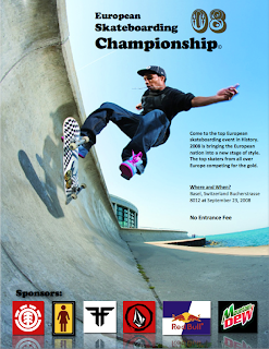
After reading the Proximity section in the book "The non-designers design book" I decided to adjust my poster. I did not change it drastically but the small changes I did apply definitely added a lot to the outlook of the poster. First I combined the when and where text box so they will feel more connected. This concept refers to proximity. After that I enlarged the font of the free of charge text to make it stand out. A lot of people will prefer to go to a festival or show if it is free of charge. The last thing i did was had shadows and reflection to the sponsor images. This allowed the images to not only feel more connected but also feel more apart of the poster. Again, referring to proximity.
No comments:
Post a Comment