Wednesday, September 24, 2008
Chapter 9 Summary
Chapter nine talks about the main six different types of font categories. These six categories consist of: Oldstyle, Modern, Slab Serif, Sans Serif, Script, Decorative. Let start off with Oldstyle.
Chapter 8 Summary
Chapter 8 "Design with Type" talks about the three main aspects when designing with types. The first concept of the three aspects is concordant. Concordant is when you don't mix your fonts at all. If you are using the concordant aspect then you are using a single font, and you aren't changing anything drastically. The most you can do, while keeping it simple is changing the title to be bold. The next aspect, is the conflicting type. Conflicting means that you are using similar fonts, sizes, and weights. This is good to catch a readers attention, but can get quite irritating; and so makes it conflicting. The third and last aspect is contrasting. Contrasting is when you use many different fonts, which are completely different . To achieve a contrasting type you might also want to change the size and weight from one another.
Monday, September 22, 2008
Article of the Week
Google
This week, the design of the week award goes to "Google". Just last week the Google team has celebrated its 10th anniversary with a net worth of 4.3 billion dollars. This is one of those companies that truly deserves each penny they make. Google has adapted many new concepts and features over the years. With its simple user interface. Friendly design concept , and great navigation buttons, Google truly deserves this award; and not just for the week, most likely for the decade. As you open Google, you see a little search bar with a few buttons on top of it, such as: Web, Images, Maps, News, Groups, Gmail, and more. You can find just about anything in Google. From websites, to songs, to map directions, language translations, and even personal mail. Google offers just about anything within network capabilities. But it did not just succeed due to all of its great features. Many companies such as Yahoo have tried doing a similar thing but failed. Google has accomplished its name due to its simplicity and effective design. It is a free, simple and easy to navigate search engine and anyone can use it. Google's design might look so extremely simple, yet the workers at Google have spent countless of hours just coming up with its design. The effective colors containing: Blue, Red, Yellow, and Green add a contrast with the white background and give a good visual look, that attracts users. Google deserves the award of the week, and as mentioned before, even the award of the decade. The simple, effective, and user friendly design makes Google the leading search engine in the world.
http://de.wikipedia.org/wiki/Google
This week, the design of the week award goes to "Google". Just last week the Google team has celebrated its 10th anniversary with a net worth of 4.3 billion dollars. This is one of those companies that truly deserves each penny they make. Google has adapted many new concepts and features over the years. With its simple user interface. Friendly design concept , and great navigation buttons, Google truly deserves this award; and not just for the week, most likely for the decade. As you open Google, you see a little search bar with a few buttons on top of it, such as: Web, Images, Maps, News, Groups, Gmail, and more. You can find just about anything in Google. From websites, to songs, to map directions, language translations, and even personal mail. Google offers just about anything within network capabilities. But it did not just succeed due to all of its great features. Many companies such as Yahoo have tried doing a similar thing but failed. Google has accomplished its name due to its simplicity and effective design. It is a free, simple and easy to navigate search engine and anyone can use it. Google's design might look so extremely simple, yet the workers at Google have spent countless of hours just coming up with its design. The effective colors containing: Blue, Red, Yellow, and Green add a contrast with the white background and give a good visual look, that attracts users. Google deserves the award of the week, and as mentioned before, even the award of the decade. The simple, effective, and user friendly design makes Google the leading search engine in the world.

http://de.wikipedia.org/wiki/Google
Thursday, September 18, 2008
Poster (Final Edit)
My final free edit of the poster, hasn't changed much from the 4th edit. I took the background color of the sponsor text and turned it off. I also took down the contrast by a bit. The reason I chose to use the contrast on the image was because it brought out the text on the blue sky. You can now read the title and the body text without problems. The sponsors at the bottom also really stand out due to the contrast level.
Wednesday, September 17, 2008
Worst Design of the Month 17.9.2008

Choosing a bad design tends to get ugly and quite frustrating, seeing as there are so many horrible designs in the market. There is one truly terrifying design, which a lot of kids must experience on a daily basis. The new school chairs. The horrible plastic, painful, and small chairs are a burden for many kids. Why isn't this a great design? oh well this question is very easy, and I am sure many would like to answer this. Well, the chairs aren't a great design because they aren't comfortable; at all. Although they don't look bad, and they do have a nice modern feel to them, they still tend to get annoying. I have never seen so many people fall of their chairs in two weeks. The sit itself is too short for the average person, and it gets really irritating. With time you do get used to it, but the a good design needs to be user friendly; meaning get used to it from the first second. It isn't the worst design that was ever created but it is definitely not the best. It does force you to sit up straight which is probably that main reason the chose this chairs. They do look quite nice but appearance is not everything. It doesn't feel comfortable, or relaxing. The worst design of the month has it screaming for the new upper school chairs.
Article of the Week
iPod Touch (Second Generation)
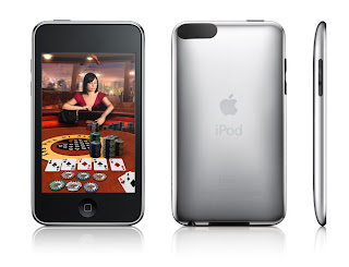
Starting from today, I will post a great design onto my blog every week. This week the design that takes home the trophy is the second generation iPod Touch. The remake of the first model definitely stands out, and has a lot of great features the first didn't have. Lets start off with its actual design concept. The new iPod Touch's design, has changed quite a bit. The back of the iPod is still made out of steel (not stainless unfortunately) but a very slick metal that gives a great visual outlook. It isn't as squared as the first generation, in fact Apple decided to adapt the design of the 3G iPhone and apply it to the new iPod. What you get now, is a rounded back made out of the same material. It does add a firmer grip to the consumer and allows for a better feeling when holding it. The volume and switch on/off button are made of black plastic which, isn't has fancy as the iPhone's metal switches but still has a nice effect. This gives the design a much more luxurious feel to it. The screen itself is still a beautiful 3.5" inch screen, but now the glass covers the entire front body; again giving a much better visual look. This is not all though. Apple has decided to add an external speaker, and a voice recorder. This is the first iPod to include such features. Now you can listen to your music on the go, without having to carry those huge hi-fi stereo systems *YAY*. The main design stayed the same. Don't expect to get new type of menus or settings of any kind. The only new thing you will get, is the App Store. The App Store might not apply to design that much, but it is a great new feature that allows you to download applications to your device. This is compatible with the iPhone and iPod Touch. If you still own the old iPod you can get the App Store by updating your iPod and paying something around 15 CHF. So let's recap. Why does the iPod Touch get the award for the design of the week? First of all, the great new design adaption from the 3G iPhone; everyone loves it. Second of all, the external speaker, which bring the iPod's to a new era that allows you to listen to your music on the go. Last but not least, is the price. The prices for the iPod Touch have gone done by a lot. This is not because Apple is doing a bad job, its because Apple is doing a great job. The iPod Touch second generation has it all; from internet browsing, photo browsing, music, videos, a great price and three different capacity models, to a great beautiful and slick design. The iPod Touch takes home the trophy for the design of the week; and it truly deserves it.
http://en.wikipedia.org/wiki/IPod_Touch
Starting from today, I will post a great design onto my blog every week. This week the design that takes home the trophy is the second generation iPod Touch. The remake of the first model definitely stands out, and has a lot of great features the first didn't have. Lets start off with its actual design concept. The new iPod Touch's design, has changed quite a bit. The back of the iPod is still made out of steel (not stainless unfortunately) but a very slick metal that gives a great visual outlook. It isn't as squared as the first generation, in fact Apple decided to adapt the design of the 3G iPhone and apply it to the new iPod. What you get now, is a rounded back made out of the same material. It does add a firmer grip to the consumer and allows for a better feeling when holding it. The volume and switch on/off button are made of black plastic which, isn't has fancy as the iPhone's metal switches but still has a nice effect. This gives the design a much more luxurious feel to it. The screen itself is still a beautiful 3.5" inch screen, but now the glass covers the entire front body; again giving a much better visual look. This is not all though. Apple has decided to add an external speaker, and a voice recorder. This is the first iPod to include such features. Now you can listen to your music on the go, without having to carry those huge hi-fi stereo systems *YAY*. The main design stayed the same. Don't expect to get new type of menus or settings of any kind. The only new thing you will get, is the App Store. The App Store might not apply to design that much, but it is a great new feature that allows you to download applications to your device. This is compatible with the iPhone and iPod Touch. If you still own the old iPod you can get the App Store by updating your iPod and paying something around 15 CHF. So let's recap. Why does the iPod Touch get the award for the design of the week? First of all, the great new design adaption from the 3G iPhone; everyone loves it. Second of all, the external speaker, which bring the iPod's to a new era that allows you to listen to your music on the go. Last but not least, is the price. The prices for the iPod Touch have gone done by a lot. This is not because Apple is doing a bad job, its because Apple is doing a great job. The iPod Touch second generation has it all; from internet browsing, photo browsing, music, videos, a great price and three different capacity models, to a great beautiful and slick design. The iPod Touch takes home the trophy for the design of the week; and it truly deserves it.

http://en.wikipedia.org/wiki/IPod_Touch
Chapter 6 Summary
The concluding chapter of the four main design principles really sums up all of what we learned. It explains the first five chapters. It states clearly that you shouldn't worry too much about you design. If you follow the principles then it should be fine. No more no less. It also says that if you see a design you like; steal it. Now, it never says take it and use it exactly the same, because that can lead to copyright issues. What it says is take a design you admire, and adapt it. All the designers do it. Everyone does it, and not just for designs, but for everything; movies, video games, books, magazines, etc. Follow the principles, keep it simple, take a design you like, adapt it, and you design should be good.
Tuesday, September 16, 2008
Poster (Edited #4)
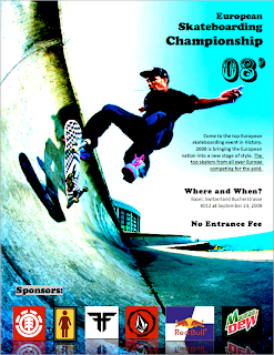
For my 4th edit on my poster, I used contrast to twick my poster. First of all, I added contrast to the colors of the background image. This allowed the black title to be displayed and shown much nicer. It also allowed the body text to be displayed. Overall it looks a lot nicer now, after the contrast concept as been applied and furnished.
Thursday, September 11, 2008
Contrast
Contrast is the key effect for visual interest in a design. It is probably the best way to attract people into looking at your design. To create contrast, you need to take to things that are alike and change them completely from one another. Use colors, line thickness, sizes, and spaces. If you use contrast correctly then you design will be eye catching and visually attractive.
Poster (Edited #3)
Wednesday, September 10, 2008
Repetition
Repetition is the the idea stating that, when you repeat something you add visual interest. Repetition unifies and strengthens a design to make it look more sustained. It design people usually refer to repetition as being consistent. To get repetition you should repeat similar fonts and colors. Sometimes contrast as a lot of principles that could add to repetition. Avoid repeating something over and over because it makes you design dull and boring. It shouldn't be over repetitive or under repetitive. If you practice enough you will learn to master repetition. If you over repeat your design will look confusing, and over-whelming; and not the good kind.
Poster (Edited #2)
Alignment
Alignment is another key feature for design. What it says is that things need to be aligned to one another. The basic concept for alignment is to organize and unify your product. It is like taking junk from the floor and throwing it into the garbage can. Alignment creates a serious, organized, and sophisticated look to your product.
Tuesday, September 9, 2008
Proximity
Proximity is a very important feature in design. It reflects a lot upon the connection between objects. If you are making a poster, you want to make sure that the things that are supposed to reflect one another are close to each other. Things that are not really connected should not be next to one another. You should not be afraid of space, in fact space is your friend. If you learn to master proximity then your designs are going to have a much more professional look.
Poster (Edited)
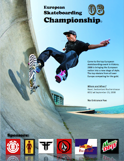
After reading the Proximity section in the book "The non-designers design book" I decided to adjust my poster. I did not change it drastically but the small changes I did apply definitely added a lot to the outlook of the poster. First I combined the when and where text box so they will feel more connected. This concept refers to proximity. After that I enlarged the font of the free of charge text to make it stand out. A lot of people will prefer to go to a festival or show if it is free of charge. The last thing i did was had shadows and reflection to the sponsor images. This allowed the images to not only feel more connected but also feel more apart of the poster. Again, referring to proximity.
Thursday, September 4, 2008
The Joshua Tree Epiphany
The first chapter in the book "The Non-Designers Design Book" starts off with a little story. The writer talks about how he got this one book about trees as a present. He talks about the first tree in the book which is called "Joshua Tree". He said he had never seen one before, so he decided to go out to his neighborhood and look at the trees. The first tree he sees, which is even in his garden, is the Joshua Tree. He talks about how he lived in that place for thirteen years and have yet to see a Joshua tree. This explains the idea stating, if you know something and your conscious of it you are in control of it. Then the book continues and the interesting part comes; The four main design principles. Contrast, Repetition, Alignment, Proximity. Lets start off with Contrast. What is it? and what makes it so important in design. Contrast is a very key feature for a design. It prevents having very similar things within your design (Type, Color, Size, Line Thickness, Shape, Space, etc.) You need to make things different, to give a good visual attraction to your audience. Now I am not saying you should put a thousand of different colors, because then you have gone beyond contrast. Contrast can work with two colors opposite from one another. For example: Black and White, Yellow and Black, Red and Black, and many more. Think of the McDonald logo. What do you think makes it so attractive, because over all the logo itself is a pretty simple logo. It is the colors that they chose that make it so attractive. Yellow and red. It is so bright and it has so much contrast you can see it from anywhere at anytime. Second Principle is Repetition. Repetition is also a very important element because it helps keep the design organized. You don't want to have a million different fonts if your doing a poster for example. It needs to be consistent. Repeating certain values such as Line Thickness, Fonts, Colors, Textures, and pictures really adds to the strength of the design. The third principle is Alignment. Alignment is also a key for organization and development. It states that things should be places randomly but still feel like they are connected. This is supposed to give it a unique and interesting look. The last principle is Proximity. It explains that items that are related should be put together. When several items of the same group are close to each other (Proximity) then they become one visual unit. This is the key of the principles and probably the most important. You want your things to be close together, and you should not be afraid of empty space.
Wednesday, September 3, 2008
Tuesday, September 2, 2008
Creativity and the Design Process

Creativity is a very important aspect to design which is usually not well understood. Many people confuse design and creativity, and they are very different from one another. A lot of people also confuse creativity and originality, and that is because they have a similar concept. Creativity is something creative, but it does not necessarily be original, and as you can already understand, originality is something original you made. It isn't bad taking other peoples main ideas and developing on them. But if you take something and you don't change it, then the problem begins. For example look at apple, a multi billion dollar that started with their so called "iPod". Everyone copied there concept, and developed on that concept. Non really beat apple, but a lot became successful. Coming up with creative and original ideas is not easy, but if you manage to come up with a great unique idea that is when you can begin you design process. If you look at hollywood today, you can see that nearly every movie out there is stealing ideas from older films. Not to mention films like Scary Movie and Superhero movie, which are such bad parodies that they are already stealing ideas and making fun of their previous films. Creativity is a very sacred concept for a designers work, and a lot of time goes into creating something new. When you get the core of your idea down, then you start the design process. The design process can take a long time to finish. For your design process you start by creating kind of a rough draft of your design, and you keep building on it. It is very similar to writing an essay and starting out with a rough draft. Sometime while in the design process, it will take you more than just one or two drafts. You want to make sure that when you are done with the design process you feel good about the final product and it stands out; unique, creative, and original.
Subscribe to:
Comments (Atom)


