Business cards; So powerful for something so small
Business cards are not what they used to be. Now-a-days if you want to pass on the name of your company you must have a catchy and stylish business. If you achieve a good design for your business card then your audience will feel more connected and involved with you. If you were to go up to a worker and ask for a business card and it would be very simple and dull, then that would be the image you would get from the company. Business cards shouldn't have too much information on them but they should be unique and designed correctly according to the design elements such as: Proximity, Alignment, Repetition, and Contrast.
Source: http://www.topdesignarticles.com/article38.html
Monday, December 1, 2008

Thursday, November 27, 2008


Wednesday, November 26, 2008

Thursday, November 20, 2008
Color
Color Basics
Colors are organized and described by three ways. First its by its name, second its how much it is desaturated and third is by its value and lightness. Colors such as pink, crimson, and brick are all variations of red, but due to their different value, lightness, and desaturation they are different.
Chorma: How pure is the hue related to grey
Saturation: The degree of purity in the hue
Intensity: The whiteness or dullness of the hue. If you had white or black it might decrease.
Luminance/Value: A measure from the amount of light reflected from the hue.
Color Systems


Color systems are different color variation which are used for different tasks. Some are better for printing while other are better for drawing.
Subtractive Colors: Subtractive colors are colors which are used for printing. They begin with white and end with black as more colors are being printed. This is also called the CMYK color system.
Additive Colors: Additive colors are the colors used in a computer. They begin with black and end with white. This is also called RGB.
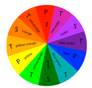
Color Wheel:
Primary Colors: Colors at their basic essence; those colors that cannot be created by mixing others.
Secondary Colors: Those colors achieved by a mixture of two primaries.
Tertiary Colors: Those colors achieved by a mixture of primary and secondary hues.
Complementary Colors: Those colors located opposite each other on a color wheel.
Analogous Colors: Those colors located close together on a color wheel.
Primary Colors: Colors at their basic essence; those colors that cannot be created by mixing others.Secondary Colors: Those colors achieved by a mixture of two primaries.Tertiary Colors: Those colors achieved by a mixture of primary and secondary hues.Complementary Colors: Those colors located opposite each other on a color wheel.Analogous Colors: Those colors located close together on a color wheel.
Color Combination
Color combinations may pass unnoticed when pleasing, yet offend dramatically when compositions seem to clash. One outcome we seek in the final form or composition, is a successful use of color.
We determine whether or not we are successful by critically assessing the visual balance and harmony of the final composition balance and harmony are achieved by the visual contrast that exists between color combinations. Planning a successful color combination begins with the investigation, and understanding, of color relationships.
Monochromatic: Relationship Colors that are shade or tint variations of the same hue.
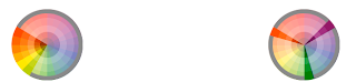
Complementary: Relationship Those colors across from each other on a color wheel.
Split-Complementary: Relationship One hue plus two others equally spaced from its complement.
Double-Complementary: Relationship Two complementary color sets; the distance between selected complementary pairs will effect the overall contrast of the final composition.
Analogous: Relationship Those colors located adjacent to each other on a color wheel.
Triad Relationship: Three hues equally positioned on a color wheel.

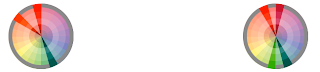
Monochromatic Relationship
Complementary Relationship
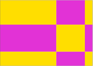
Split-Complementary Relationship
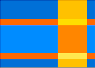
Double-Complementary Relationship
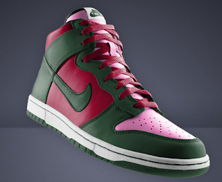
Analogous Relationship

Triad Relationship

Colors are organized and described by three ways. First its by its name, second its how much it is desaturated and third is by its value and lightness. Colors such as pink, crimson, and brick are all variations of red, but due to their different value, lightness, and desaturation they are different.
Chorma: How pure is the hue related to grey
Saturation: The degree of purity in the hue
Intensity: The whiteness or dullness of the hue. If you had white or black it might decrease.
Luminance/Value: A measure from the amount of light reflected from the hue.
Color Systems


Color systems are different color variation which are used for different tasks. Some are better for printing while other are better for drawing.
Subtractive Colors: Subtractive colors are colors which are used for printing. They begin with white and end with black as more colors are being printed. This is also called the CMYK color system.
Additive Colors: Additive colors are the colors used in a computer. They begin with black and end with white. This is also called RGB.
Color Wheel:
Primary Colors: Colors at their basic essence; those colors that cannot be created by mixing others.
Secondary Colors: Those colors achieved by a mixture of two primaries.
Tertiary Colors: Those colors achieved by a mixture of primary and secondary hues.
Complementary Colors: Those colors located opposite each other on a color wheel.
Analogous Colors: Those colors located close together on a color wheel.
Primary Colors: Colors at their basic essence; those colors that cannot be created by mixing others.Secondary Colors: Those colors achieved by a mixture of two primaries.Tertiary Colors: Those colors achieved by a mixture of primary and secondary hues.Complementary Colors: Those colors located opposite each other on a color wheel.Analogous Colors: Those colors located close together on a color wheel.

Color Combination
Color combinations may pass unnoticed when pleasing, yet offend dramatically when compositions seem to clash. One outcome we seek in the final form or composition, is a successful use of color.
We determine whether or not we are successful by critically assessing the visual balance and harmony of the final composition balance and harmony are achieved by the visual contrast that exists between color combinations. Planning a successful color combination begins with the investigation, and understanding, of color relationships.
Monochromatic: Relationship Colors that are shade or tint variations of the same hue.
Complementary: Relationship Those colors across from each other on a color wheel.
Split-Complementary: Relationship One hue plus two others equally spaced from its complement.
Double-Complementary: Relationship Two complementary color sets; the distance between selected complementary pairs will effect the overall contrast of the final composition.
Analogous: Relationship Those colors located adjacent to each other on a color wheel.
Triad Relationship: Three hues equally positioned on a color wheel.


Monochromatic Relationship

Complementary Relationship

Split-Complementary Relationship

Double-Complementary Relationship

Analogous Relationship

Triad Relationship

Bibliography
"Bauhaus." Wikipedia. 2008. Wiki. 6 Nov 2008 .
I chose Wikipedia because it is an easy source to understand, and has a lot of good information about Bauhaus.
Angela , Lilleystone. "Bauhaus School 1919-1933." www.cs.umb.edu. 2008. edu. 6 Nov 2008.
I chose this particular source because it’s a visually explanatory source. It has some information, but the good thing about it is that it describes its images and it gives you an overview of the style the Bauhaus used.
"Bauhuas - Archiv Museum of Design." http://www.bauhaus.de/. Bauhaus. 6 Nov 2008.
I chose this source because it is an original Bauhaus website. It has examples and historic information about Bauhaus and its artists.
"Bauhaus 1919-1933." http://www.bauhaus-dessau.de. Dessau. 6 Nov 2008.
This source is probably the best source I got, because it explains about everything from the history of Bauhaus to its unique modern style.
"Art History: Bauhaus School." http://wwar.com. 05 Feb 2006. World Wide Art Resources. 6 Nov 2008.
I chose this source because it explains the history of Bauhaus really in depth, how it was founded, and how the began their style.
I chose Wikipedia because it is an easy source to understand, and has a lot of good information about Bauhaus.
Angela , Lilleystone. "Bauhaus School 1919-1933." www.cs.umb.edu. 2008. edu. 6 Nov 2008
I chose this particular source because it’s a visually explanatory source. It has some information, but the good thing about it is that it describes its images and it gives you an overview of the style the Bauhaus used.
"Bauhuas - Archiv Museum of Design." http://www.bauhaus.de/. Bauhaus. 6 Nov 2008
I chose this source because it is an original Bauhaus website. It has examples and historic information about Bauhaus and its artists.
"Bauhaus 1919-1933." http://www.bauhaus-dessau.de. Dessau. 6 Nov 2008
This source is probably the best source I got, because it explains about everything from the history of Bauhaus to its unique modern style.
"Art History: Bauhaus School." http://wwar.com. 05 Feb 2006. World Wide Art Resources. 6 Nov 2008
I chose this source because it explains the history of Bauhaus really in depth, how it was founded, and how the began their style.
Thursday, November 13, 2008
Poster Rationale - Bauhaus
I chose Bauhaus as my design movement. The reason I got so attracted to the style of the school was due to its complete elegance and modern feel of their work. What Bauhaus tries to show with their design is that design is everywhere and you can find it anywhere. The main concept that Bauhaus has is architecture, where they make posters that try to show the building point of view that they have. I chose to design a similar poster to a one made in Bauhaus (look at bottom of the page for the image). The reason I chose this particular poster was because it really shows the beginning in a new design era in the early 1900's. I started my poster on a black background to give a feel for elegance and strength. I then mainly used squared rectangles, and triangles to design the outlook of my poster. This is a thing Bauhaus is greatly known for. They use very few different shapes. This is because they want to keep it simple, yet attractive to the eye and modern. In the Bauhaus school the students were taught to use only a few colors. This is because they believe that too much color ruins the design, and gives it a crazy post-modernist feeling. The effect that you get from three contrasting colors is far greater then the effect you get from ten different colors combined. This is the reason I chose to use a grey-blue, black, yellow, and white. The reason I chose black, yellow, and white is because it’s three out of the four most influential colors within the Bauhaus history. The Bauhaus school is known for using yellow, red, black, and white. I did not choose red because it would make the poster look too hard on the eyes, so I decided to keep it simple with the colors. I used many different layers that overlap each other and create new shapes. This again is something that a lot of people did in Bauhaus only they did in Bauhaus just with paper, in order to achieve an architecture design. The Bauhaus designs symbolize structure, concrete socially critical, and surrealist works. I tried to take all of these ideas and incorporate them into my design. When you look at my poster you will see polygons with different colors overlapping but there is a great message behind it. It is supposed to represent a new era of design where architecture is straight, simple, and effective. My poster is asymmetrical and really sends out a feeling of a modern, sharp design. I used the Bauhaus font just for the title of the poster. I did this with the Bauhaus 93 font because on nearly every Bauhaus poster, the title is represented with the original Bauhaus font saying “Bauhaus”. The rest of the text was done in simple sans serif font. I used contrast in my poster to represent the title, the text, and the date stating "1919-1933". I decided to put the date of the Bauhaus years because a lot of Bauhaus posters seem to have the lively years of the school. Alignment was also a very big part in my poster. A lot of the shapes are aligned with each other for a particular reason. This reason is to keep the poster consistent just like the designers in Bauhaus do. Proximity with text was also an issue that I had to figure out, but eventually did. I tried to keep the poster simple yet I had to make sure I had 25-50 words, which looked connected to the Bauhaus title. Overall, I believe that I did a pretty good job on hitting the concept of the Bauhaus design movement. My poster looks clean, modern, and yet, very elegant.

Subscribe to:
Posts (Atom)