Wednesday, October 29, 2008

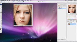
Photoshop CS3 - How to color things naturally Tutorial

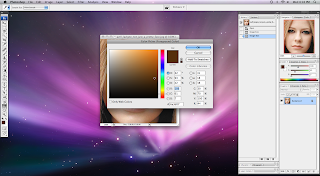
Step 1: Take a picture you want to re-color. As you can see I am using a standard face.

Step 2: Open photoshop and import the picture.

Step 3: Choose a color that you want to use and apply to the photo.

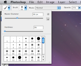
Step 4: Select the brush tool, in the tool box, and select on opacity and flow around 25%.

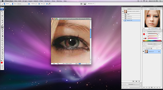
Step 5: Zoom into your picture using the magnifier tool in the tool box. Make sure your brush size is not too big, and not too small to re-color the spot that you want.


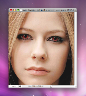
Step 6: Start drawing thin layers of color with the brush in the area that you wish to re-color. You don't want to go over the spot with too many layers because then it will look unnatural.

Step 7: Zoom out and enjoy the make over.

Monday, October 6, 2008

Wednesday, October 1, 2008

Helvetica Movie Notes

helvetica movie notes
Movie Notes - Helvetica

Helvetica used in:
• Brand names (American Airlines, IBM, Met life, greyhound, deBijenkorf, Sears, Jeep, BMW, Toyota, McLare, Aprilia, Kawasaki, Target, Tupperware, Nestle, verizon, conEdison, Lufthansa, Muko, Energizer,Saad, Oral-B, The North Face, Fendi, Staples, Fifa, Adidas etc.) loads of car brands, because it is clean
• Informative signs
• Street signs
• Logos

It is:
• Simple
• Neutral
• Easy on the eye
• It is sans serif, has no serif
• Letters have uniformity
• Perfect spacing
Modernist font – represents modern ideas of space, movement, timing, relaxed, but it is sans serif and easy on the eye.
Bad because Ubiquities (everywhere)
• It is everywhere
• Boring
• Too simple
• Perfect
Represents government identities (because it makes you feel safe)
Corporal
Means it is institutional
Its modern in and out. Retro modern

Creating a Font

first design the h.
It has a straight line and the semi-circle, then the o and p are very simple to do. When those are there, you have n, u, p, d, b,
Continue writing words which create the rest of the letters
who structure is based on the horizontal slicing of of terminals.
Nothing cut of at an angle, only complete horizontal
designer cant improve helvetica.
Other than being authoria, beaurocratic, and epressiam, using helvetica they seem, excesable, transparent, and accountable.

Font gives a corportion a tone... fancy font, fancy company, excesable font, makes it excesable company.

Real typeface = needs rythm and contrast... helvetica has neither

Arial is a copy of Helvetia

Helvetica:
needs lots of space around it
tired to make every letter look the same which is very bad.

Typeface is part of branding, branding is projecting quality

Michael C. Place another great designer talks about how he believes that Helvetica can be used with any subject, you just need to know how to use it. On the other hand some designers such as David think that you should use a different font for every subject. Again going back into subjective and objective.

Decorative

Decorative typeface is easy to identify. If it looks bad, and makes you feel sick, most likely that you are looking at a decorative font. Decorative typefaces are great, they are unique, and easy to use. But you if you use them to much, then it doesn't feel good. They are good to use in Titles, or if you want to make something stand out. They bring contrast, and a a certain uniqueness to the design. Some decorative fonts consist of Party, Potrzebie, Improv, Pious Henry, Juniper, Juice, Fajita, and Scarlett.


Script

Script typefaces include all those typefaces that appear to have been hand written. Script is supposed to represent hand writing with a pen, a brush, and sometimes even a pencil. Some examples of script consist of Arid, Shelly Volante, Legary. Cascade, Linoscript, and Zapf Chancery.


Sans Serif

Sans Serif is a old typeface that became popular in the twentieth century. The word sans mean "without" in French. They called it sans because it has no serifs a the end of the strokes. Sans serif typefaces are mono-weight which means that there is no visible thick and thin transitions in the strokes. The letterforms are the same thickness. Some examples of Sans Serif consist of Antique Olive, Formata, Folio, Franklin Gothic, Futura, Condensed, Syntax, and Helvetica.


Slab Serif

Slab Serif type faces came from the industrial revolution. It came as a new concept for advertisement. Slab Serif have little or no thick and thin transitions. Some examples of Slab Serif consist of Clarendon, Memphis, Memphis Extra Bold, New Century Schoolbook.


Modern

Modern type faces are fonts which are very elegant with striking appearances especially when set very larger. They have thick and thin transitions and a very good contrast. They are serifs that, but instead of slanted they are horizontal. Some examples of Modern type faces consist of Bodoni, Times Bold, Onyx, Fenice, Ultra, Walbaum.


Oldstyle

Oldstyle is one of the more basic fonts. Types such as Goudy, Palatino, Times New Roman, Baskerville, and Garamond are all oldstyle. This category is based on handlettering of scribes. The category consists have serif fonts. The are all curved strokes in the letterforms and have transitions from thick to thin. This is called the "Thick/Thin Transition". If you draw a line through the thinnest parts of the curved strokes, the line is diagonal. This is called stress.