Tuesday, December 16, 2008
Student Council Remake Project - Color Schemes
Brief: We have decided that we would like the student body to see us primarily as a bridge carrying their voice to the administration. We would also like the students to see us as a realistic agent of change, meaning that we have the ability to get stuff done as long as they help us out by sharing their opinions and voicing their needs.
The first color scheme that I proposed consists of the colors: Red, Orange, and Silver. This is a very effective color scheme and works along with the Student Council brief. They want their group to feel strong, meaningful, and active and with this colorful they most definitely receive that. The red represents leadership and power, the silver represents hard working and responsibility, and the orange represents being open to ideas, and evolving.
Examples
The second color scheme I came up with consists of the colors: brown, grey, and green. This is because all of them have one thing in common and that is that they represent reliability and productiveness.
Example
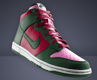
The third color scheme I came up with consists of the colors: pink, blue, and brown. This is because pink indicates trust, and that is what the Student Council wants people to have in them, the blue shows creativity, loyalty, and intelligence, and finally brown represents the strength and reliability of the Student Council.
Weekly Article 10
First Semester: Last Article Post
Nicki: http://johnsthoughtstoday.blogspot.com
Article of the Week 1: New iPod Nano
Article of the Week 2: Furniture Massimo Vignelli
Article of the Week 3: Colors
Article of the Week 4: David Carson
Article of the Week 5: Postmodernism
Article of the Week 6: Modbooks
Article of the Week 7: The Design Cycle
Article of the Week 8: Adidas F50 Tunit
Article of the Week 9: Blackberry Storm
Felix: http://fpdh.blogspot.com/
Article of the Week 1: Nike's Mercurial Vapor Super Lite
Article of the Week 2: BMW X6
Article of the Week 3: eclipse design phone
Article of the Week 4: The New MacBook
Article of the Week 5: Adidas Adi Pure
Article of the Week 6: Blackberry Storm
Article of the Week 7: Q5
Article of the Week 8: You Don't Mess With the Zohan
Article of the Week 9: Cell Phone
Sakkti: http://charlie6330.blogspot.com/
Article of the Week 1: "The Design Environment"
Article of the Week 2: Editing Photos
Article of the Week 3: iPod Cases
Article of the Week 4: Macbook
Article of the Week 5: Windows 7/Windows Vista
Article of the Week 6: Google Chrome
Article of the Week 7: Choosing Correct Color
Article of the Week 8: The Apple Logo
Article of the Week 9: Google Phone
Hongjin: http://ddjack-peter.blogspot.com/
Article of the Week 1: Designing in Balance
Article of the Week 2: Balance in Design
Article of the Week 3: Emphasis in Design
Article of the Week 4: Using Color Wheels and Color Theory
Article of the Week 5: Shapes in Design
Article of the Week 6: Designing a Website
Article of the Week 7: Color Symbolism
Article of the Week 8: 35 Deadly Website Sins
Article of the Week 9: Writing Well for the Web
Vincent: http://blog-on-blogger.blogspot.com/
Article of the Week 1: iPhone
Article of the Week 2: Album Covers
Article of the Week 3: Nokia Phone
Article of the Week 4: 20 Minute Magazine
Article of the Week 5: iPod Nano Chromatic
Article of the Week 6: Branding
Article of the Week 7: Article "Bin Bin"
Article of the Week 8: Improving your Website
Article of the Week 9: Phone Designs
-------------------------------------------------------------------------
Three Articles that I chose...
Article of the Week 8: The Apple logo
http://charlie6330.blogspot.com/
When I read this article I was really fascinated by the information because I am a huge fan of Apple and have asked myself countless of times what the "Apple" meant and what where its origins. This article explained it to me very well and I have learned a lot about its beginning. The first thing I learned was that the first Apple logo was called "Rainbow Apple" since it had colorful stripes within it. It said that the designer of this logo was Rob Janoff who wanted to honor the discoveries of light and implement them into his logo. A major influence on the Apple logo was weirdly enough: Isaac Newton. This is because he discovered a lot about the principles of gravity and when Rob Janoff designed the Apple logo he thought of the apple falling down from the tree from the story of Adam in Eve in the Bible.
Article of the Week 7: The Design Cycle
http://johnsthoughtstoday.blogspot.com
This article about the design cycle was very interesting because it provided both present and historical information on the origins and use of the design cycle. It starts off by talking about how scientists came to the idea that they first must research and conduct information before actually going on with the experiment. In many ways the design cycle and the idea of thought before action brought the use of hypothesis. The design cycle is divided into four different sections consisting of: plan, investigate, evaluate, and create. As you can see the last thing you must do is create since the three steps before them are the most important. If you skip or miss one step then your overall design will come out bad.
Article of the Week: Postmodernism
http://johnsthoughtstoday.blogspot.com
I chose this article since I wanted to find out a little bit more about postmodernism, and to say the truth this did provide me with great information. Postmodernism mean "After the modernist movement", and the term "modern" can be referred to as something of the present such as movies and literature. I thought this was a very interesting topic because for one of my previous projects I chose "Bauhaus" which is modernist, so it was very interesting to learn a little more about what came after the modern movement. Postmodernism was greatly influenced by modernism and takes a lot of key elements. However postmodernism is very complex and does not follow most of the rules for modernism. It tends to refer to cultural, intellectual, and artistic principles of the modern world. It is a way of expressing one self. Postmodernism tends to get quite crazy with all of the different colors and contrasts but that's what makes it so unique and so different from previous movements such as modernism.
Article of the Week
Apple iMac
This week I chose the Apple iMac for my design of the week. I believe that the Apple iMac is an extraordinary product that looks great and works even better. On of the reasons that the iMac got so much attention besides the fact that Apple spent millions on advertising it, was due to the fact that the entire computer (CPU) is in the screen. This saves so much space and gives the overall experience a much more elegant feel. The iMac is a great machine too in terms of power and speed. But the main reason so many people want one is because of its gorgeous design. The screen itself is made out of recyclable aluminum and there is glass covering the screen. The screen ranges from 20 inches to 24 inches and both models look great. Overall I believe that the Apple iMac is a great design and you can definitely see that Apple spent a lot of money and time on designing this true magnificent product.
Article of the Week
USB
This week I chose the typical design of a simple USB stick. I believe that the USB stick is one of the most creative, effective, and productive electronic devices. The typical USB stick is usually about 6 - 10 cm in length and half a cm in width. They are very light and very easy to carry. The USB stick was made to be easily understood and it is really user friendly. Anyone can pick up one and use it with under 2 minutes. There are obviously more advanced and unique USB sticks with different lights and flip open tricks but they are put just to up the price of the product. Over all I believe that the typical USB stick is a great design that is both inexpensive, and extremely use friendly.
Sunday, December 14, 2008
Friday, December 12, 2008
Friday, December 5, 2008
Thursday, December 4, 2008
Wednesday, December 3, 2008
Tuesday, December 2, 2008
Logo Practice
The logo that I have created for "Flawlex" is a very simple. However, it included a variety of colors that really make it stand out. The background of the logo is two similar squared combined. They are in the color grey to represent intelligence, reliability, and the overall quality of the company. The color I used for the big "X" is which is the letter that really represents the company is red, because red is a color the shows strength, energy, and really brings out a sense of "Great" quality within the company's products.
Monday, December 1, 2008
Article of the Week
Choosing a good "Domain" name
Choosing a domain name for a website is more difficult then you might think. First of all what is a domain? A domain is the name of your website. One thing you want to do when choosing a domain name, is have it be unique, yet simple. Take www.google.com as an example. Google is a great name which is so simple that not only made the website one of the most successful websites, but also made the word "google" official in dictionaries, with synonyms such as "search". To choose a domain name you first need to go and search which words are searched the most on the internet. This will give you a quick overview of which words you should look at.
Source: http://www.topdesignarticles.com/article19.html
Article of the Week
Business cards; So powerful for something so small
Business cards are not what they used to be. Now-a-days if you want to pass on the name of your company you must have a catchy and stylish business. If you achieve a good design for your business card then your audience will feel more connected and involved with you. If you were to go up to a worker and ask for a business card and it would be very simple and dull, then that would be the image you would get from the company. Business cards shouldn't have too much information on them but they should be unique and designed correctly according to the design elements such as: Proximity, Alignment, Repetition, and Contrast.
Source: http://www.topdesignarticles.com/article38.html
Thursday, November 27, 2008
Wednesday, November 26, 2008
Thursday, November 20, 2008
Color
Color Basics
Colors are organized and described by three ways. First its by its name, second its how much it is desaturated and third is by its value and lightness. Colors such as pink, crimson, and brick are all variations of red, but due to their different value, lightness, and desaturation they are different.
Chorma: How pure is the hue related to grey
Saturation: The degree of purity in the hue
Intensity: The whiteness or dullness of the hue. If you had white or black it might decrease.
Luminance/Value: A measure from the amount of light reflected from the hue.
Color Systems
Color systems are different color variation which are used for different tasks. Some are better for printing while other are better for drawing.
Subtractive Colors: Subtractive colors are colors which are used for printing. They begin with white and end with black as more colors are being printed. This is also called the CMYK color system.
Additive Colors: Additive colors are the colors used in a computer. They begin with black and end with white. This is also called RGB.
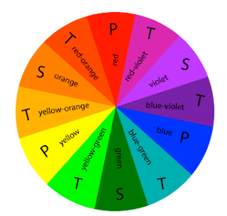
Color Wheel:
Primary Colors: Colors at their basic essence; those colors that cannot be created by mixing others.
Secondary Colors: Those colors achieved by a mixture of two primaries.
Tertiary Colors: Those colors achieved by a mixture of primary and secondary hues.
Complementary Colors: Those colors located opposite each other on a color wheel.
Analogous Colors: Those colors located close together on a color wheel.
Primary Colors: Colors at their basic essence; those colors that cannot be created by mixing others.Secondary Colors: Those colors achieved by a mixture of two primaries.Tertiary Colors: Those colors achieved by a mixture of primary and secondary hues.Complementary Colors: Those colors located opposite each other on a color wheel.Analogous Colors: Those colors located close together on a color wheel.
Color Combination
Color combinations may pass unnoticed when pleasing, yet offend dramatically when compositions seem to clash. One outcome we seek in the final form or composition, is a successful use of color.
We determine whether or not we are successful by critically assessing the visual balance and harmony of the final composition balance and harmony are achieved by the visual contrast that exists between color combinations. Planning a successful color combination begins with the investigation, and understanding, of color relationships.
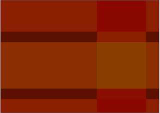
Monochromatic: Relationship Colors that are shade or tint variations of the same hue.
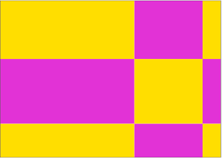
Complementary: Relationship Those colors across from each other on a color wheel.
Split-Complementary: Relationship One hue plus two others equally spaced from its complement.
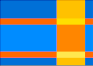
Double-Complementary: Relationship Two complementary color sets; the distance between selected complementary pairs will effect the overall contrast of the final composition.
Analogous: Relationship Those colors located adjacent to each other on a color wheel.
Triad Relationship: Three hues equally positioned on a color wheel.
Monochromatic Relationship
Complementary Relationship
Split-Complementary Relationship
Double-Complementary Relationship
Analogous Relationship
Triad Relationship
Subscribe to:
Posts (Atom)